Contrast And Human Perception In Design
Designing better experiences by understanding how we see the world.
In this article, we will explore the concept of contrast and its fundamental role in UX and visual design.
Let’s start by defining what contrast is.
The definition of contrast
Contrast is the quality of two juxtaposed elements to be different from one another.
Contrast determines the way our senses perceive our surroundings and the properties of the objects we interact with. In the words of author Dan M. Mrejeru:
Based on contrast, perception distinguishes signal from noise and foreground from background. — Solovki’s Ersatz: On the Evolution of Modern Human Brain explains:
Let’s take a look at a couple of examples.
We perceive variations in microtonalities in music as fluctuations of the same note, also known as vibrato. However, we interpret broad, symmetrical differences in the frequencies of subsequent notes as musical. Conversely, asymmetric frequencies are considered dissonant.
Small temperature variations are also nearly imperceptible. You’ll have a hard time distinguishing between 75℉ (23.8℃) and 76℉ (24.4℃), but you will notice the change of temperature when you step outside your house on a cold winter morning.
Visual contrast in our devices
Of all the different kinds of contrast that our senses are capable of perceiving, visual contrast is the essential type of contrast for UX and digital design.
The main output of digital products is visual.
The stimuli produced by the hardware of our devices remains constant, whether it’s a touchscreen or a keyboard. What changes is what we see on the display, which is determined by the software.
To create useful software, it is vital to be aware of the different types of visual contrast in design.
Types of visual contrast in design
There are five types of visual contrast in UX and visual design:
- Color
- Proportion
- Shape
- Proximity and space
- Movement
Let’s explore them in detail.
Color
Our eyes evolved to perceive a portion of the electromagnetic spectrum called visible light.
The wavelengths of this spectrum range from about 400 nanometers to 700 nanometers (nm). Our brain processes different wavelengths as different colors. E.g., We perceive the wavelengths from 490 nm to 450 nm as the color blue.
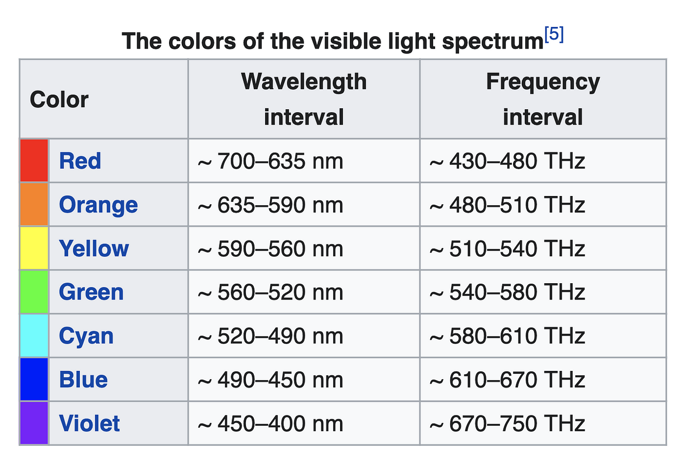
The larger the difference in wavelengths in a pair of colors, the more contrast there is between them.
But of course, there’s an exception.
Even though red and violet have very different wavelengths, there’s little contrast between them. Why? Well, I couldn’t find the scientific reason, but my theory is that both of these colors are at the limit of what our eyes see.
Shorter wavelengths than red are referred to as infrared light, and longer wavelengths than violet give us ultraviolet light. Both of them are invisible to the human eye.
We believe it was Sir Issac Newton, the first one who came up with the idea to organize the visible spectrum in a circular diagram giving birth to the chromatic wheel. This is an excellent way to illustrate the contrast relationship between the colors we can see.
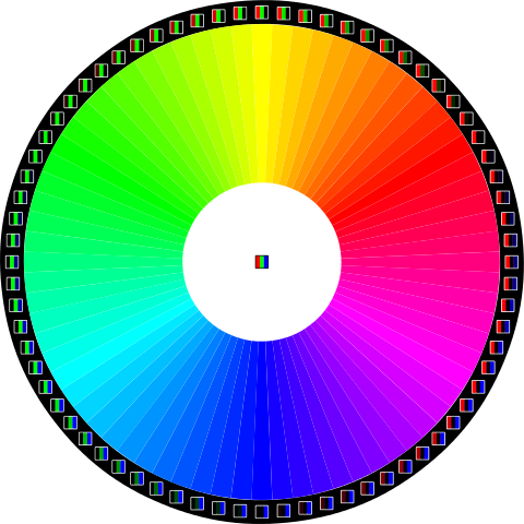
Opposing colors on the chromatic wheel create a sharp contrast. We call them complementary colors. And they look good together. Like blue and yellow, which are the colors of a sunny day on the beach.
Proportion
Proportion is the relationship in size between two elements. The more significant their difference in size, the more visual contrast there will be. This also applies to the sides of any same object.
The reason we are so sensitive to substantial differences in proportion has to do with our evolution. Humans love symmetry. And we don’t really like asymmetry.
As Dan M. Mrejeru points out, our brains interpret asymmetry as dangerous:
Symmetry plays an important role in natural selection because within nature the asymmetry is a sign of illness, threat or danger [sic] — Solovki’s Ersatz: On the Evolution of Modern Human Brain.
Like with extreme temperatures, our senses are particularly reactive to things that might be harmful. This is why we are so sensitive to asymmetry and why you cringe when a frame is crooked (the struggle is real).

But as you probably guessed, there is an exception to the rule. It turns out there’s a specific type of asymmetry we are more than ok with, we love it, and that’s the golden ratio. In the words of Johannes Kepler:
Geometry has two great treasures; one is the Theorem of Pythagoras; the other, the division of a line into extreme and mean ratio. The first we may compare to a measure of gold, the second we may name a precious jewel.
— Johannes Kepler
You can write entire books exploring the implications of the golden ratio in design, but we’re not going to go down that rabbit hole. Suffice it to say we perceive it as just as proportional as perfect symmetry. You could say it’s the ideal asymmetry.
Shape
When all other variables are equal, two objects of different geometry will look different, contrasting with one another.
Shape contrast is particularly evident when working with type. A pair of letters of equal size and color will look very different. We attribute sounds and concepts to different shapes, allowing us to write and read.
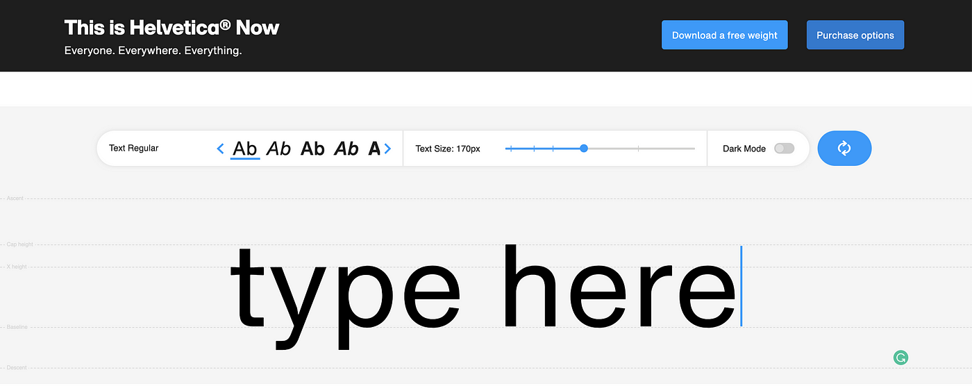
Some designers are masterful at font pairing, which is the art (it truly is) of combining different typefaces that look good together.
Keep in mind some typefaces have more contrast and therefore are more legible. If you want to learn more about the properties of fonts and typography, I recommend you check out The Elements of Typographic Style by Robert Bringhurst.
Spacing and separation
Objects in nature that are close together are usually related. Conversely, the larger the distance between them, the less they relate to one another.
Without getting too metaphysical here, this stems from the fact that, in evolution, pairs of objects that are harmful to one another won’t survive to reproduce and, therefore will go extinct.
But of course, you guessed it. There are exceptions, such as parasites and viruses.
The key concept here is that, in your interface, you can use the perception of space to indicate the user which groups of elements are related and should be interpreted as one. This is known as chunking.
You can also utilize space to guide the user’s eye to what you want them to focus on. Remember: perception distinguishes signal from noise, so if you want to make something stand out, place it in the middle of a lot of negative space.
In design, the separation between elements or groups of elements is known as white or negative space.
The quintessential modern example of using spacing and chunking in design is, of course, Apple.
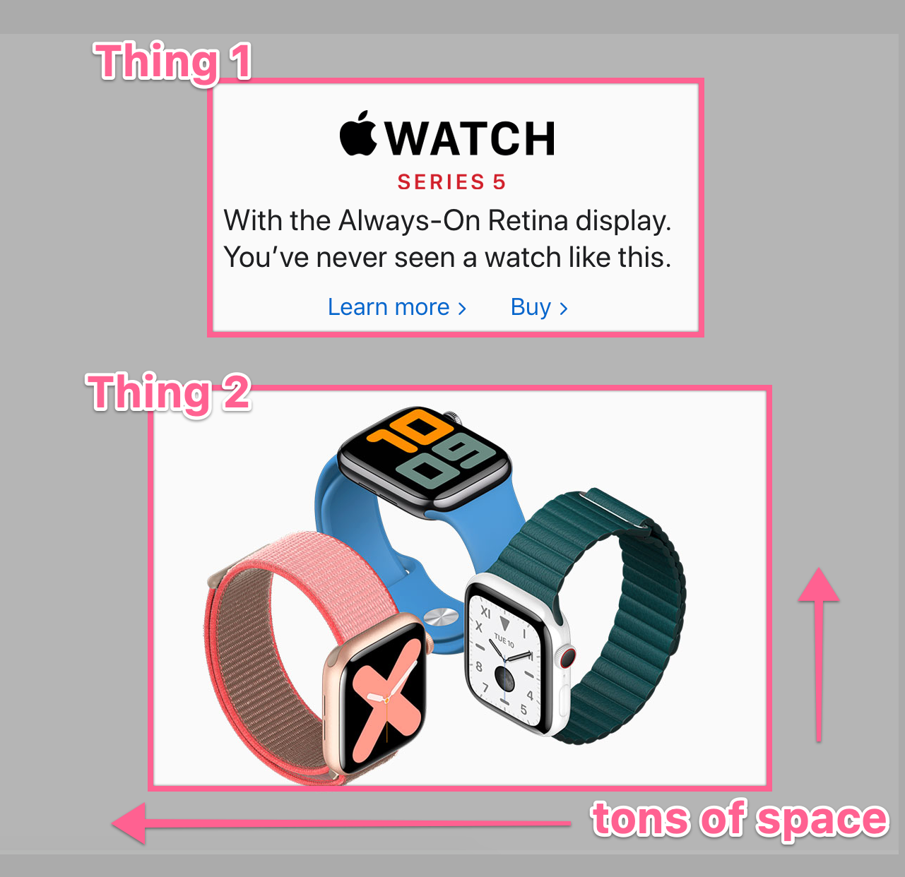
Using spacing and separation is a great way to break down large pieces of information into bite-sized chunks, reducing cognitive load.
Movement
Last by not least, our eyes are fantastic at detecting movement
The fovea, where our visual acuity is sharpest, represents only about 1% of our entire visual field. The rest, known as peripheral vision, is low resolution.
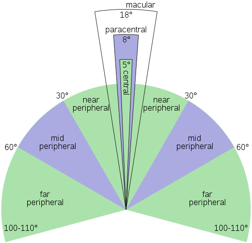
Yet there is a good amount of research that suggests our peripheral vision is actually attuned to detect movement (Bartram, Ware & Calvert, 2001).
Regardless of whether we detect it through foveal or peripheral vision, using animation makes things stand out against their background.
In conclusion
There are five types of contrast you can use to make an interface more natural to use. They are all connected to the way our eyes evolved to perceive our environment.
- Color
- Proportion
- Shape
- Proximity and space
- Movement
Learn how each one plays a role in creating contrast and take advantage of them to improve the UX of your product.